Mockups That Sell: Garment Colors, Contrast and Print Area
Samet KapucuoğluOctober 6, 20262 min read
The first photo has one job
In Etsy search your first photo is a small thumbnail next to dozens of others. Before anything else it has to answer one question at a glance: what is printed on this? Everything below is about making that answer obvious.
Match the design to the garment
Contrast first
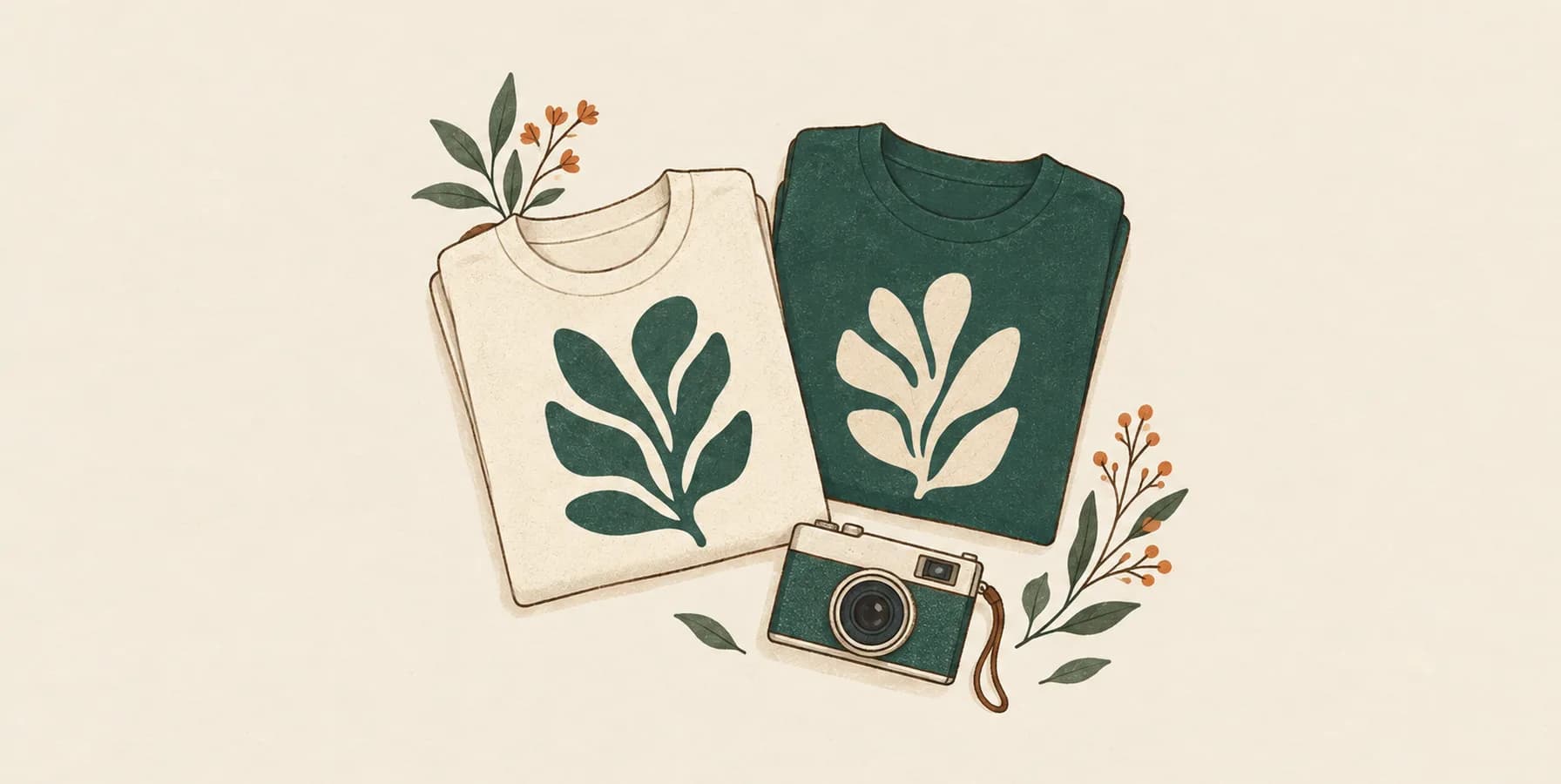
A dark design on a light garment, or a light design on a dark garment. Dark navy artwork on a charcoal shirt may look fine on your screen at full size and vanish at thumbnail size. Lead with the color where the design has the strongest contrast, even if it is not your favorite color.
Check the design's own colors
Designs with a light outline or a light background shape can work on both, but check thin details: fine light lines on a white shirt disappear first.
Podinfly does this automatically when it picks mockups: it reads the design's tones and chooses templates where dark designs go on light garments and light designs on dark ones.
Why white prints vanish in some mockups
Most mockup templates place the design with a multiply blend so the print picks up the fabric's folds and texture. Multiply can only make colors darker: anything white in your design becomes the color of the garment underneath. On a white shirt that is invisible; on a black shirt your white text simply disappears.
If your design uses white ink, use templates built for dark garments, which keep light colors visible while still showing fabric texture. Always look at the finished mockup at small size before publishing.
Make the print area big enough
A design that fills only a small part of the photo is unreadable as a thumbnail. Crop or choose templates where the garment fills the frame and the print area takes up a meaningful share of the image. Podinfly's rule for the first photo is a template where the print area covers at least 39% of the image, so the design is the first thing a shopper sees.
Build the rest of the gallery
After the first photo, use the gallery to answer the next questions a buyer has:
- Other colors: a grid or separate photos of each color you offer
- Scale: the design on a person, so the print size is clear
- Details: a close-up of the print
- Size chart and care: clear, readable information images
Our guide to a 10-frame listing image strategy goes through a complete gallery.
Keep it honest
Mockups should show what the buyer will receive. Use the actual garment colors you sell and a realistic print size. A mockup that makes the print look larger or brighter than the finished product leads to disappointed buyers.
How Podinfly helps
Podinfly places your design on real product photos, chooses templates that suit the design's colors, and lets you add your own mockup photos too. You can review every mockup before anything is sent to Etsy.